深圳龙华`LOGO标志设计
数字龙华·中轴新城
The year 2020 marks the 40th anniversary of the establishment of Shenzhen Special Economic Zone and also it is the closing year of the 13th Five-Year Plan. The year 2021 is the 100th anniversary of the founding of the Communist Party of China and the opening year of the 14th Five-Year Plan.
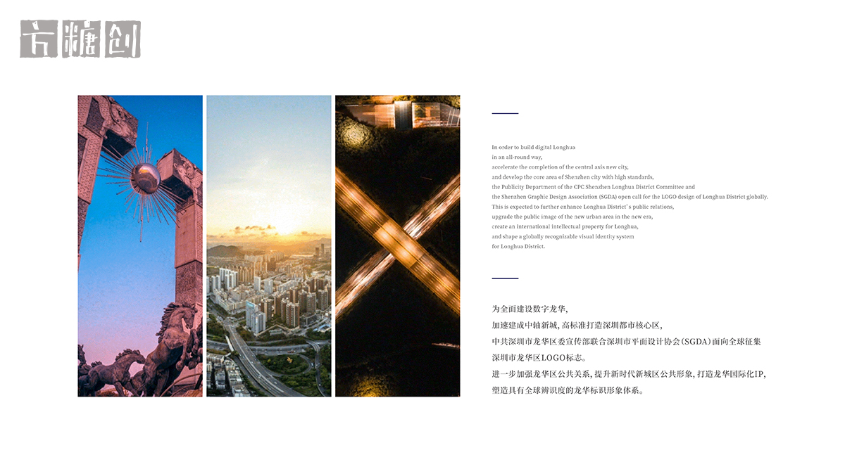
为全面建设数字龙华,加速建成中轴新城,高标准打造深圳都市核心区,中共深圳市龙华区委宣传部联合深圳市平面设计协会(SGDA)面向全球征集深圳市龙华区LOGO标志。进一步加强龙华区公共关系,提升新时代新城区公共形象,打造龙华国际化IP,塑造具有全球辨识度的龙华标识形象体系。
In order to build digital Longhua in an all-round way, accelerate the completion of the central axis new city, and develop the core area of Shenzhen city with high standards, the Publicity Department of the CPC Shenzhen Longhua District Committee and the Shenzhen Graphic Design Association (SGDA) open call for the LOGO design of Longhua District globally.This is expected to further enhance Longhua District’s public relations, upgrade the public image of the new urban area in the new era, create an international ntellectual property for Longhua, and shape a globally recognizable visual identity system for Longhua District.
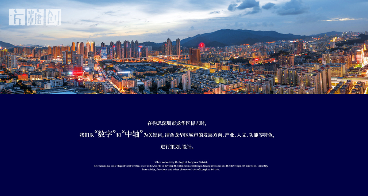
在构思深圳市龙华区标志时,我们以“数字”和“中轴”为关键词,结合龙华区城市的发展方向、产业、人文、功能等特色,进行策划、设计。
When conceiving the logo of Longhua District,Shenzhen, we took "digital" and "central axis" as keywords to develop the planning and design, taking into account the development direction, industry,humanities, functions and other characteristics of Longhua District.
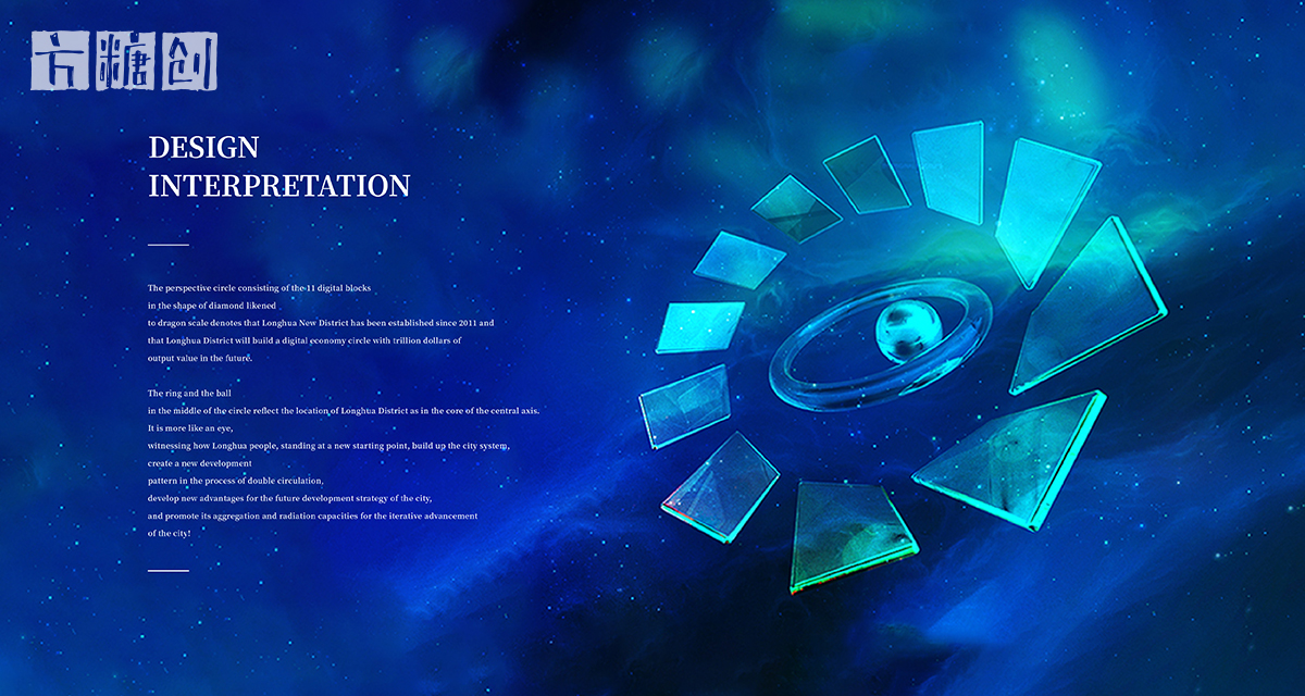
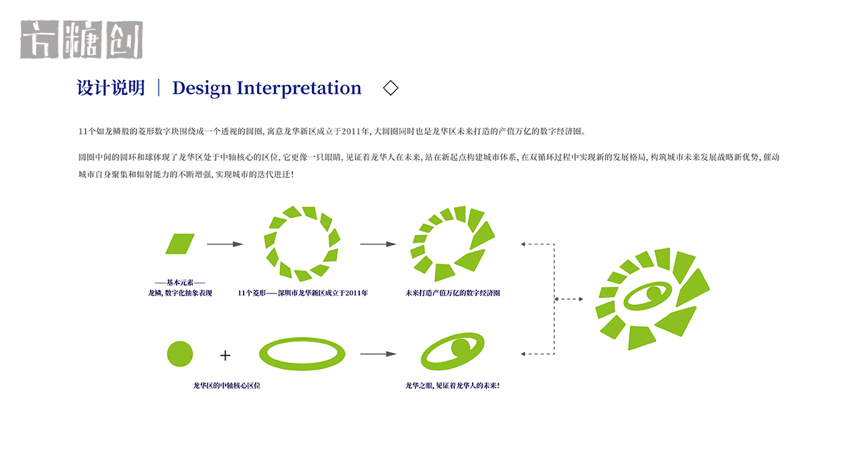
设计说明 //
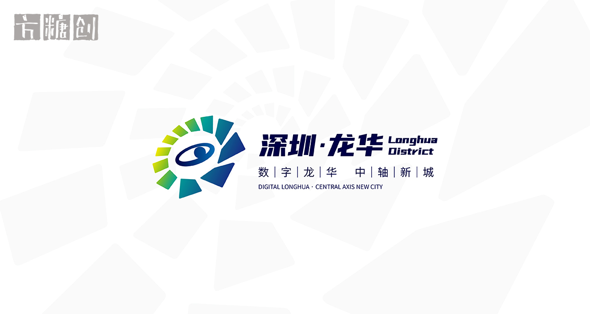
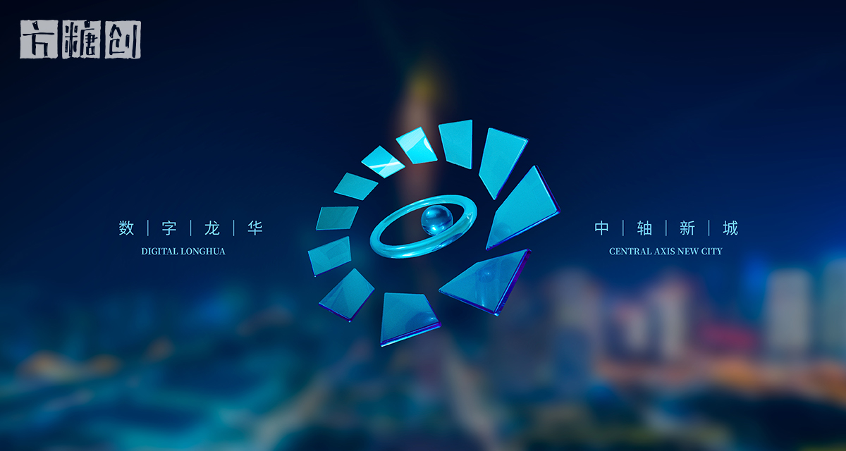
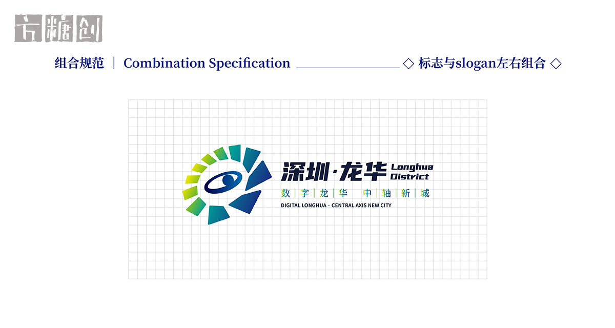
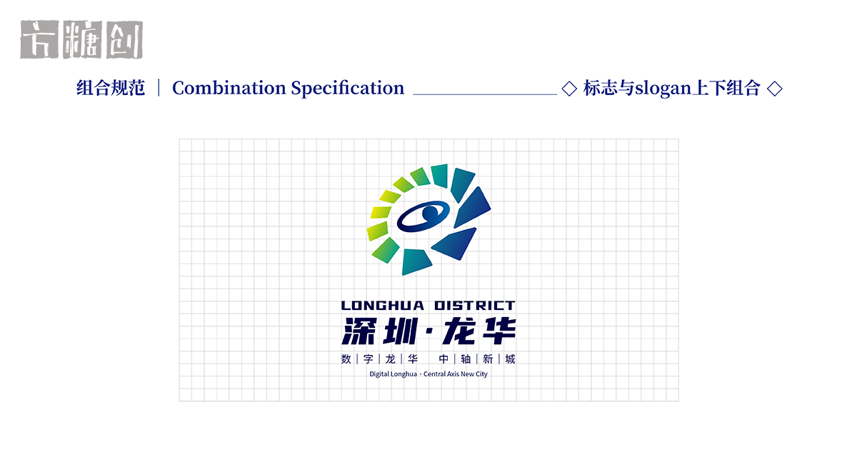
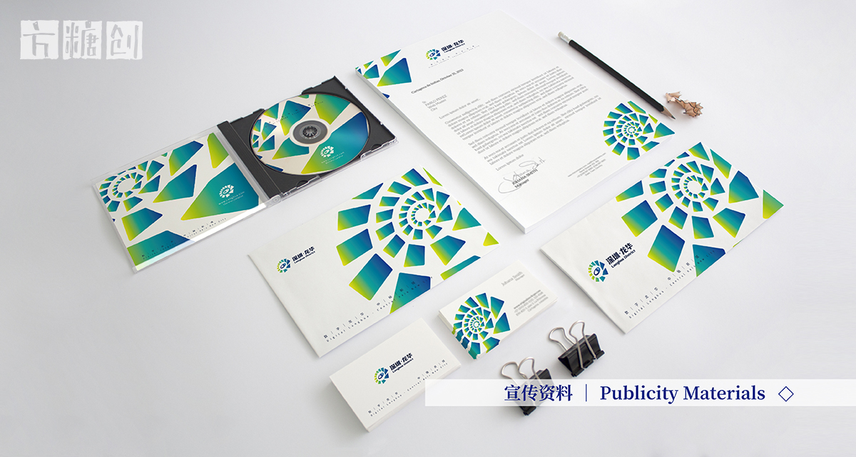
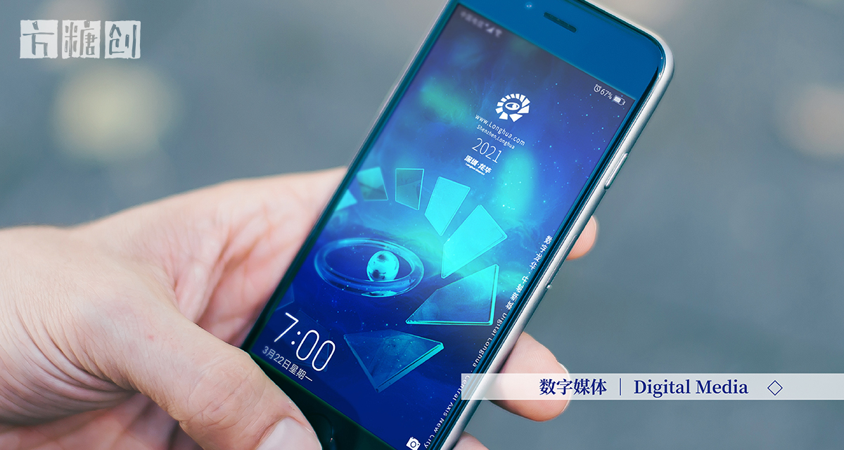
11个如龙鳞般的菱形数字块围绕成一个透视的圆圈,寓意龙华新区成立于2011年,大圆圈同时也是龙华区未来打造的产值万亿的数字经济圈。圆圈中间的圆环和球体现了龙华区处于中轴核心的区位,它更像一只眼睛,见证着龙华人在未来,站在新起点构建城市体系,在双循环过程中实现新的发展格局,构筑城市未来发展战略新优势,催动城市自身聚集和辐射能力的不断增强,实现城市的迭代进迁!
Design Interpretation //
The perspective circle consisting of the 11 digital blocks in the shape of diamond likened to dragon scale denotes that Longhua New District has been established since 2011 and that Longhua District will build a digital economy circle with trillion dollars of output value in the future. The ring and the ball in the middle of the circle reflect the location of Longhua District as in the core of the central axis. It is more like an eye,
witnessing how Longhua people, standing at a new starting point, build up the city system,create a new development pattern in the process of double circulation, develop new advantages for the future development strategy of the city, and promote its aggregation and radiation capacities for the iterative advancement of the city!
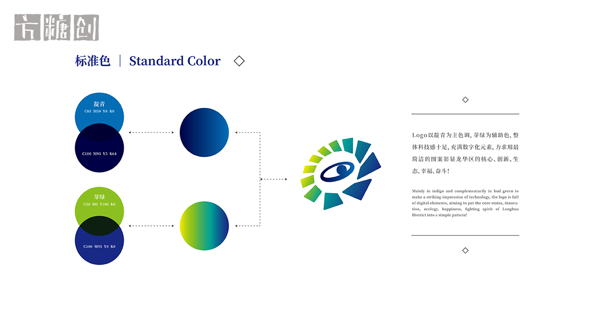
Logo以靛青为主色调,芽绿为辅助色,整体科技感十足,充满数字化元素,力求用最简洁的图案彰显龙华区的核心、创新、生态、幸福、奋斗!
Mainly in indigo and complementarily in bud green to make a striking impression of technology, the logo is full of digital elements, aiming to put the core status, innovation, ecology, happiness, fighting spirit of Longhua District into a simple pattern!
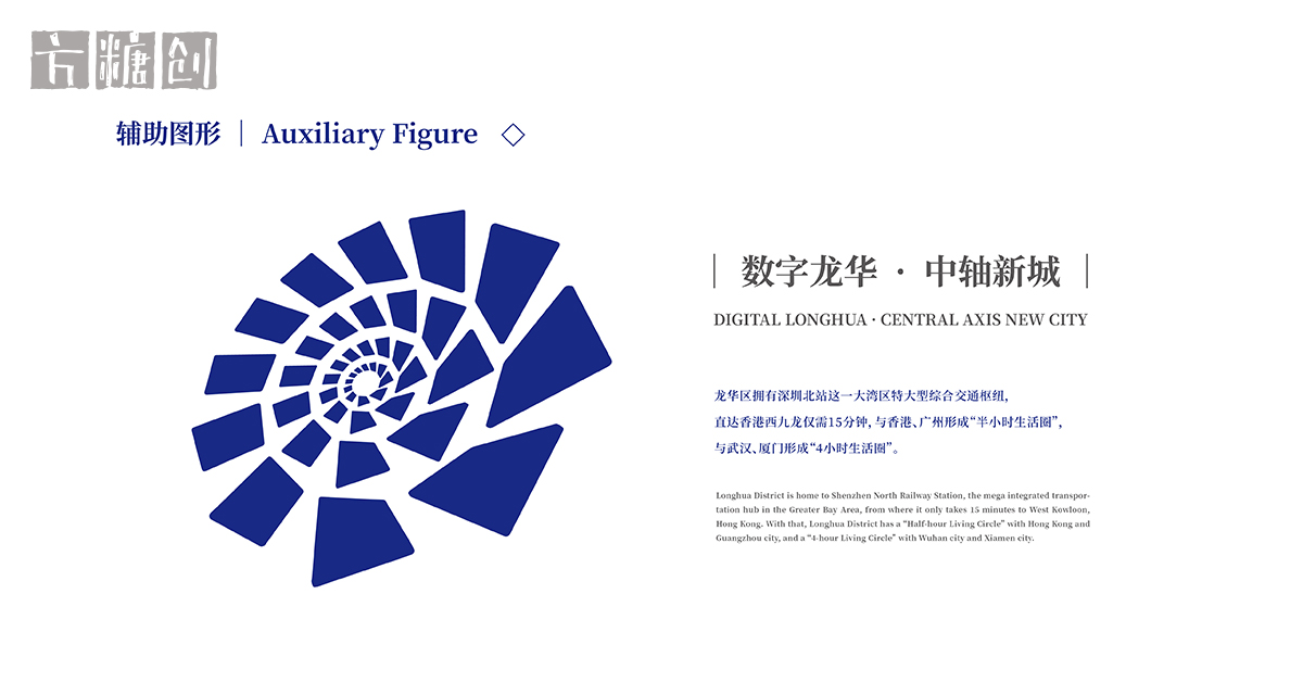
龙华区拥有深圳北站这一大湾区特大型综合交通枢纽,直达香港西九龙仅需15分钟,与香港、广州形成“半小时生活圈”,与武汉、厦门形成“4小时生活圈”。
Longhua District is home to Shenzhen North Railway Station, the mega integrated transportation hub in the Greater Bay Area, from where it only takes 15 minutes to West Kowloon, Hong Kong. With that, Longhua District has a “Half-hour Living Circle” with Hong Kong and Guangzhou city, and a “4-hour Living Circle” with Wuhan city and Xiamen city.
Digital Longhua·Central Axis New City
The year 2020 marks the 40th anniversary of the establishment of Shenzhen Special Economic Zone and also it is the closing year of the 13th Five-Year Plan. The year 2021 is the 100th anniversary of the founding of the Communist Party of China and the opening year of the 14th Five-Year Plan.
为全面建设数字龙华,加速建成中轴新城,高标准打造深圳都市核心区,中共深圳市龙华区委宣传部联合深圳市平面设计协会(SGDA)面向全球征集深圳市龙华区LOGO标志。进一步加强龙华区公共关系,提升新时代新城区公共形象,打造龙华国际化IP,塑造具有全球辨识度的龙华标识形象体系。
In order to build digital Longhua in an all-round way, accelerate the completion of the central axis new city, and develop the core area of Shenzhen city with high standards, the Publicity Department of the CPC Shenzhen Longhua District Committee and the Shenzhen Graphic Design Association (SGDA) open call for the LOGO design of Longhua District globally.This is expected to further enhance Longhua District’s public relations, upgrade the public image of the new urban area in the new era, create an international ntellectual property for Longhua, and shape a globally recognizable visual identity system for Longhua District.
在构思深圳市龙华区标志时,我们以“数字”和“中轴”为关键词,结合龙华区城市的发展方向、产业、人文、功能等特色,进行策划、设计。
When conceiving the logo of Longhua District,Shenzhen, we took "digital" and "central axis" as keywords to develop the planning and design, taking into account the development direction, industry,humanities, functions and other characteristics of Longhua District.
设计说明 //
11个如龙鳞般的菱形数字块围绕成一个透视的圆圈,寓意龙华新区成立于2011年,大圆圈同时也是龙华区未来打造的产值万亿的数字经济圈。圆圈中间的圆环和球体现了龙华区处于中轴核心的区位,它更像一只眼睛,见证着龙华人在未来,站在新起点构建城市体系,在双循环过程中实现新的发展格局,构筑城市未来发展战略新优势,催动城市自身聚集和辐射能力的不断增强,实现城市的迭代进迁!
Design Interpretation //
The perspective circle consisting of the 11 digital blocks in the shape of diamond likened to dragon scale denotes that Longhua New District has been established since 2011 and that Longhua District will build a digital economy circle with trillion dollars of output value in the future. The ring and the ball in the middle of the circle reflect the location of Longhua District as in the core of the central axis. It is more like an eye,
witnessing how Longhua people, standing at a new starting point, build up the city system,create a new development pattern in the process of double circulation, develop new advantages for the future development strategy of the city, and promote its aggregation and radiation capacities for the iterative advancement of the city!
Logo以靛青为主色调,芽绿为辅助色,整体科技感十足,充满数字化元素,力求用最简洁的图案彰显龙华区的核心、创新、生态、幸福、奋斗!
Mainly in indigo and complementarily in bud green to make a striking impression of technology, the logo is full of digital elements, aiming to put the core status, innovation, ecology, happiness, fighting spirit of Longhua District into a simple pattern!
龙华区拥有深圳北站这一大湾区特大型综合交通枢纽,直达香港西九龙仅需15分钟,与香港、广州形成“半小时生活圈”,与武汉、厦门形成“4小时生活圈”。
Longhua District is home to Shenzhen North Railway Station, the mega integrated transportation hub in the Greater Bay Area, from where it only takes 15 minutes to West Kowloon, Hong Kong. With that, Longhua District has a “Half-hour Living Circle” with Hong Kong and Guangzhou city, and a “4-hour Living Circle” with Wuhan city and Xiamen city.
深圳龙华`LOGO标志设计·1
深圳龙华`LOGO标志设计·2
深圳龙华`LOGO标志设计·3
深圳龙华`LOGO标志设计·4
深圳龙华`LOGO标志设计·5
深圳龙华`LOGO标志设计·6
深圳龙华`LOGO标志设计·7
深圳龙华`LOGO标志设计·8
深圳龙华`LOGO标志设计·9
深圳龙华`LOGO标志设计·10
深圳龙华`LOGO标志设计·11
深圳龙华`LOGO标志设计·12
深圳龙华`LOGO标志设计·13
深圳龙华`LOGO标志设计·14
深圳龙华`LOGO标志设计·15
深圳龙华`LOGO标志设计·16
深圳龙华`LOGO标志设计·17
深圳龙华`LOGO标志设计·18